-
- foodpanda rolls out a refreshed brand and visual identity to more than 400 cities across 12 markets
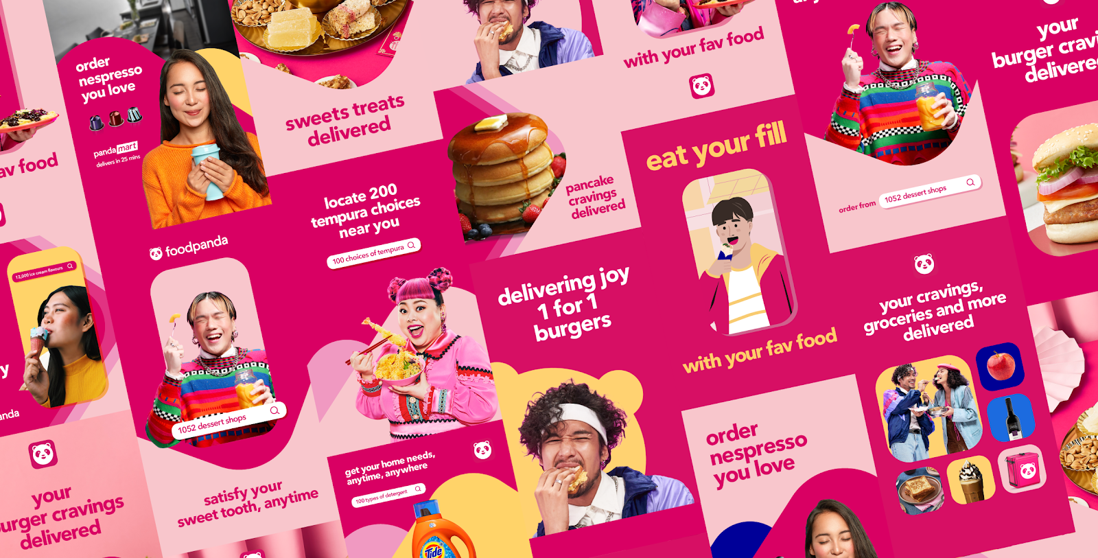
- New colours and patterns accentuate foodpanda’s signature pink across a growing range of services
- Refreshed mobile app interface makes foodpanda even more user friendly
- Rollout of branding, marketing campaigns and partner material will be refreshed progressively from April 2021
5 April 2021 — SINGAPORE — foodpanda, Asia’s leading food and grocery delivery platform, has unveiled a colourful brand refresh across all its visual designs, plus an even friendlier user interface for its mobile and web applications. The brand refresh will be rolling out progressively in more than 400 cities across 12 markets, from April 2021.
The brand refresh comes at a time when foodpanda continues to expand its business verticals beyond food delivery, into quick commerce (q-commerce), including grocery delivery via pandamart cloud stores, and through partnerships with leading shops and convenience stores.
“foodpanda’s refreshed identity reconsiders all customer touchpoints with the brand, connecting the technology behind our app and website with our millions of users’ everyday experiences, from our iconic rider bags and jackets to packaging, marketing campaigns and the app itself,” said Idan Haim, vice president of Growth and Marketing, foodpanda. “This will build a solid foundation for our new business ventures, with a revitalized look and feel.”
Online, foodpanda’s enhanced colour palette, as well as the increased prominence of its signature panda logo, caters to an expanding number of new business services. The new homescreen on the foodpanda app, dubbed the “bento”, allows users to seamlessly choose the foodpanda service they need – food delivery, self pick-up, shops or pandamart – while making it easier to explore top restaurants and promotions available in their location.
The same visual approach applies to foodpanda’s marketing initiatives both online and offline, for instance with rider- and partner-related branding, foodpanda retains its bold, instantly identifiable “fun pink”, but expands its palette to include more complementary colours.
Reinald Chee, head of Creative at foodpanda, said: “Pink is king. We keep the fun pink that is instantly recognisable to millions of people across Asia. At the same time, we highlight different aspects of our brand personality, to show that foodpanda is also friendly, caring, smart, and that little bit rebellious – not afraid to change the status quo or take risks. Our aim has been to create a design language that’s as seamless as our transaction process. At the end of the day, brand identity is all about making a more enjoyable experience for everyone.”
As the iconic symbol of foodpanda, the smiling panda mascot that people know and love remains prominent, but now comes in many more new designs, from panda stickers to patterns and shapes within designs.
Chee explained: “We analyzed every touchpoint with our service, from the app to the rider box. Using thorough insights about the user journey, we envisioned a design direction that could bridge the gap between our tech and the real-life experience of millions of customers.”
foodpanda’s brand refresh will be progressively introduced across all online and offline platforms from April 2021. The refresh has started in Singapore, Bangladesh and Cambodia, and will be launching in Hong Kong, Japan, Laos, Malaysia, Myanmar, Pakistan, the Philippines, Taiwan and Thailand in the coming weeks.
foodpanda has been growing its footprint across Asia, providing millions of customers a convenient way to get food and daily essentials delivered safely to doorsteps, which was especially critical in the midst of the pandemic.
foodpanda is the third most downloaded food delivery app in the world in 2020, according to Apptopia.


Share